Gabriel Wilkins

Graduate student at the University of Wisconsin, Madison for Urban and Regional Planning
BAs in Geography and Environmental Studies, Philosophy
3+ years of experience with GIS applications (including QGIS, R, ENVI, ArcMap, and ArcGIS Online).
View My LinkedIn Profile
Late March, 2020 Twitter Behavior Related to COVID-19
Lab Project for Advanced GIS course at UMBC
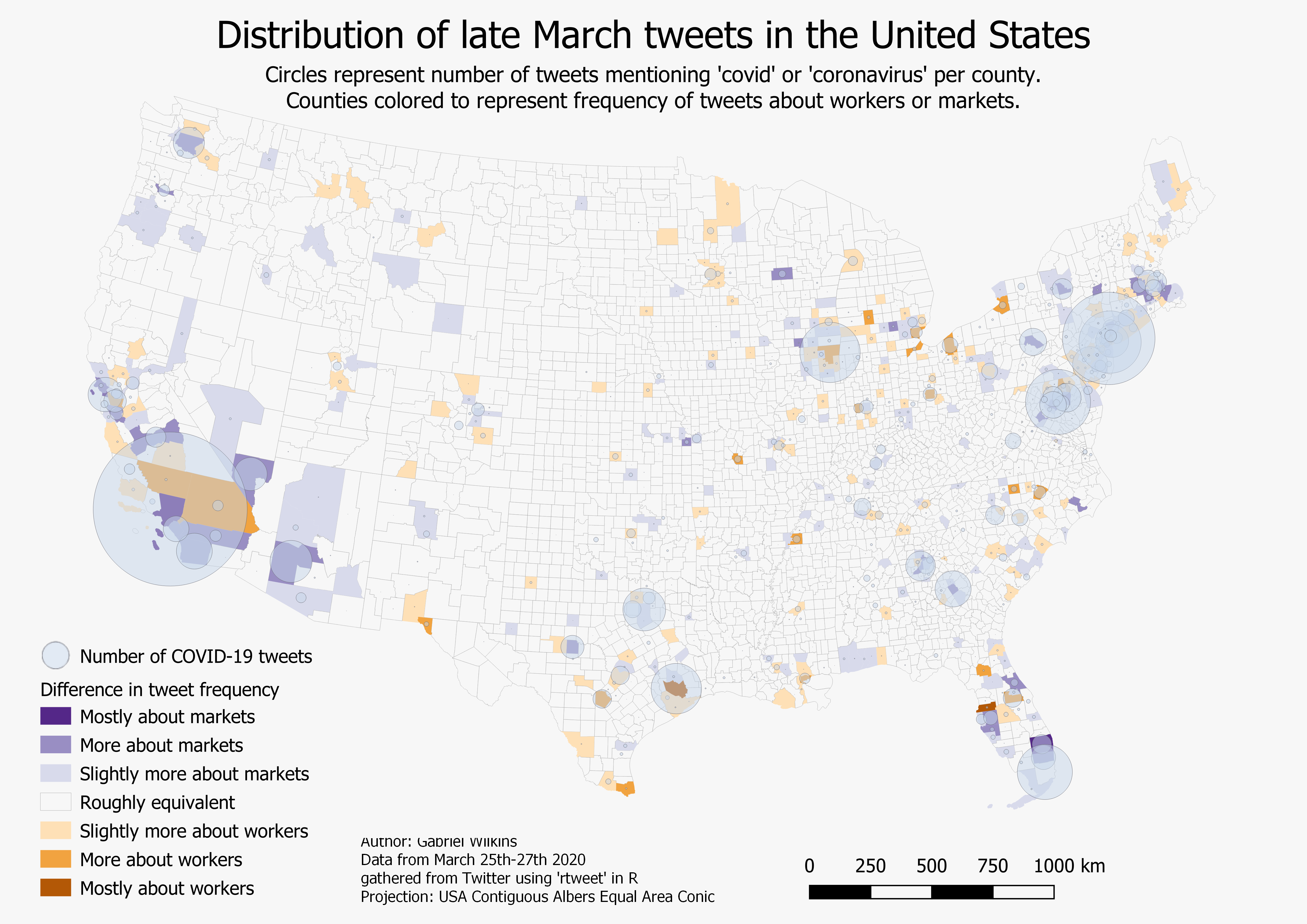
The spread of COVID-19 across the United States began to quickly pick up pace in mid-to-late March, 2020. As many cities, counties, states, and businesses changed practices significantly in order to reduce the spread of the virus, millions of workers across the US were suddenly unemployed and stock markets became much more volatile and fell dramatically. The idea behind this project is that what people are tweeting more about may indicate what they care, or are more aware, about. With intense impacts to both markets and workers during this period in late March, 2020, significant differences in what people were tweeting about could offer insight into local awareness or concern for either markets or workers.
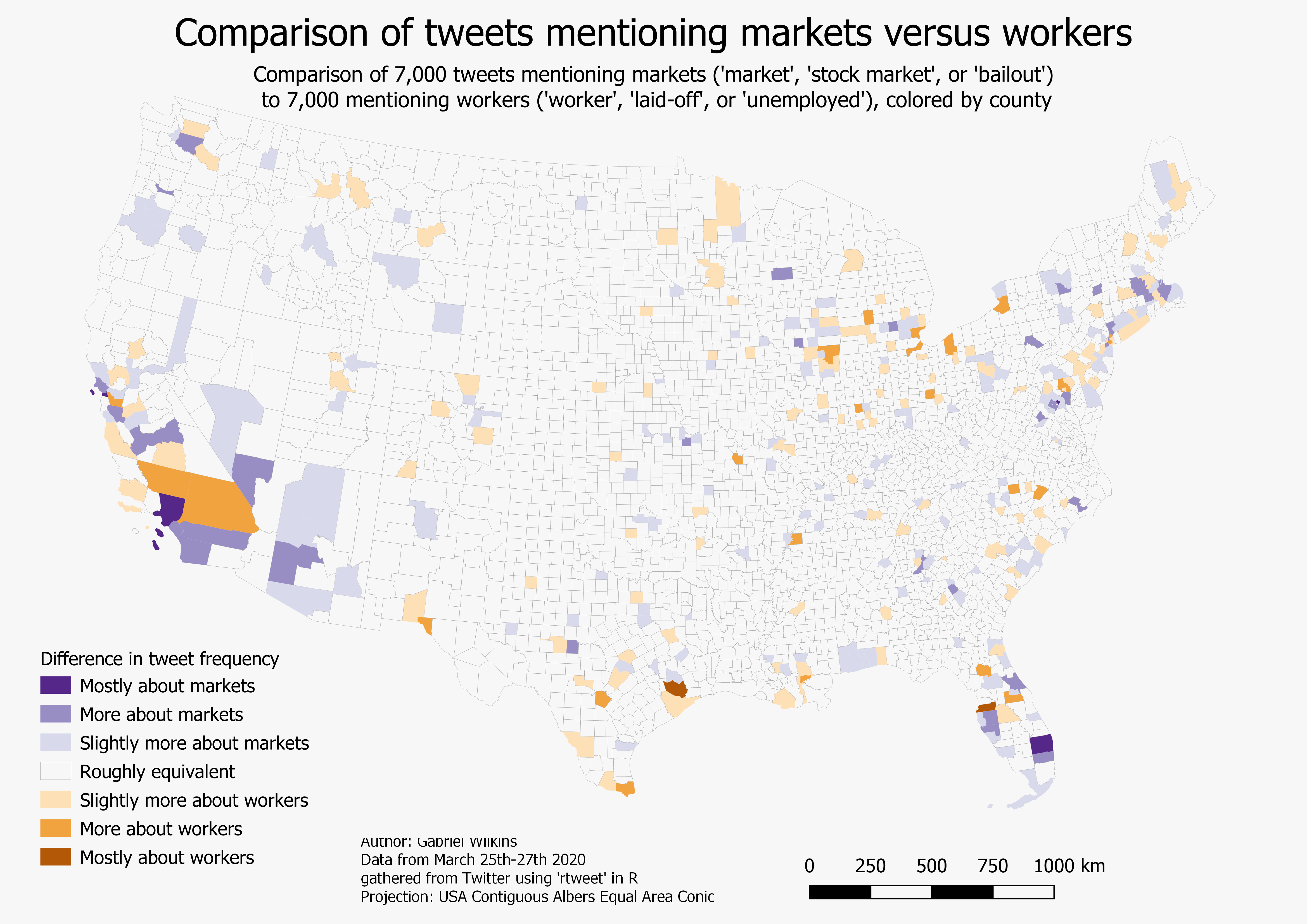
This project gathered data from Twitter to investigate the frequency and distribution of tweets related to COVID-19 as well as workers or markets. Over 11,000 tweets mentioning COVID-19 were gathered, as well as 7,000 mentinoing markets and 7,000 mentioning workers.
The number of tweets from March 25th-27th, 2020 within each county and independent city in the contiguous United States, as well as the the District of Columbia, were totaled.
The tweets about COVID-19 (those mentioning ‘covid’ or ‘coronavirus’) are displayed in circles sized in proportion to the total number.
Tweets about markets (those mentioning ‘market’, ‘stock market’, or ‘bailout’) were subtracted from tweets about workers (those mentioning ‘worker’, ‘unemployed’, or ‘laid-off’), and the difference is displayed using a diverging color scheme.
This map has the COVID-19 tweets frequencies removed for clarity, so that it just shows the county-level difference in tweets relating to markets versus workers.
Example code used to gathered tweets, using the rtweet package:
All data is projected in Albers USA Contiguous Albers Equal Area Conic.
Made using QGIS 3.10 and R 3.6.